Rolling out Momentum in 14 days
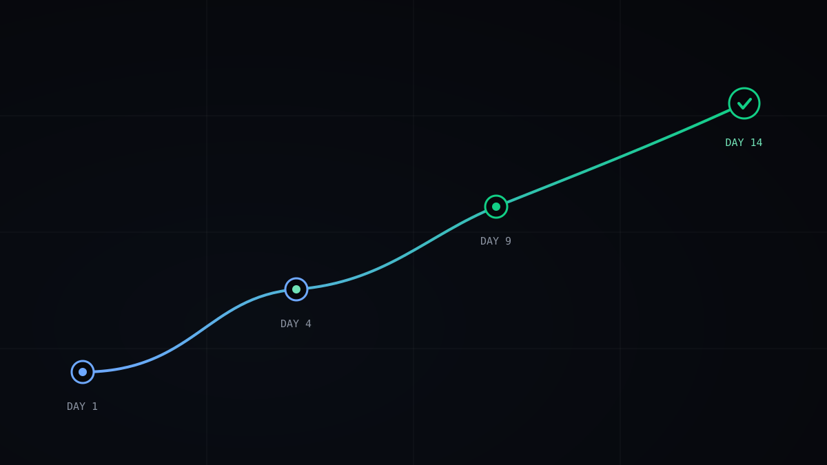
We have watched hundreds of deployments since 2024, and the failures share a shape: rushed installs, vague announcements, and managers with dashboards before employees have answers. This is the two-week sequence that avoids all three, drawn from the rollouts that went quietly right.
“The install takes four minutes. The trust takes fourteen days, and you only get one attempt at it.”
Before day one: decide what you will never do
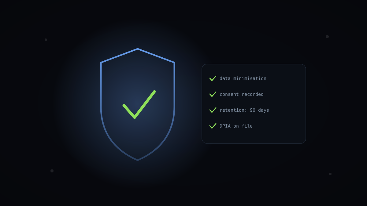
Every smooth rollout we have supported began with leadership writing down the prohibitions, not the goals. No individual data in performance reviews for the first year. No drill-down without a logged reason. No metric-based termination decisions, full stop. Written, signed, published internally.
This document does more for adoption than any feature. When a sceptical engineer asks ‘what stops my manager misusing this?’, the answer is a named policy with a named owner, not a shrug.
A 300-person insurance firm we onboarded last year credits this one artefact for their works-council approval taking three weeks instead of the six months their previous tooling attempt consumed.
Days 1–3: announce like you mean it
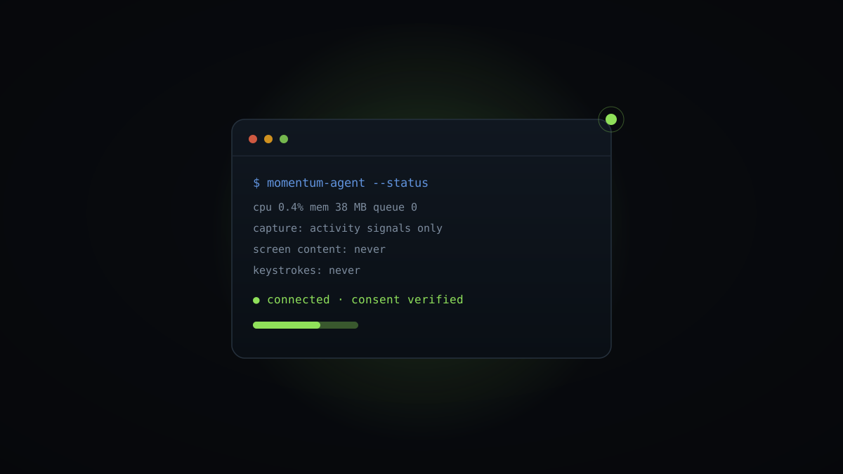
The announcement should come from the most senior sponsor, in a live forum with questions, never as a Friday-afternoon email. Cover three things plainly: exactly what the agent records, exactly what it cannot record, and who sees what, in that order.
Then say the uncomfortable part out loud: yes, this is measurement, and here is the problem we are trying to solve with it. Naming the staffing crunch or the burnout worry you are actually addressing lands better than pretending the tool is a gift.
Expect hard questions. The rollouts that fail are not the ones with hostile questions on day one; they are the ones where nobody felt safe asking any.
Days 4–7: employees first, dashboards later
Install the agent on volunteers first, and give every volunteer their personal dashboard the same hour. For the first week, nobody else sees anything. People watch their own day render into data and, almost universally, get curious rather than defensive.
This sequencing is the single most consequential decision in the whole fortnight. In deployments that flipped it, managers first, the tool acquired a reputation it never shed.
One volunteer at a Nairobi logistics customer put it well in their pilot survey: ‘I checked what it said about my Tuesday before deciding whether to trust it with my Wednesday.’ That is the exact evaluation you want people making, individually, in private.
Days 8–9: turn on team views with the team watching
When aggregate views go live, do it in a session where the team looks at their own data together, with their manager, before the manager ever sees it alone. Walk through what the heatmap shows, what the focus trend means, and what it deliberately cannot answer.
Something useful happens in these sessions almost every time. The team spots a real finding in the first twenty minutes, an overloaded Thursday, a meeting sitting on peak focus hours, and the conversation shifts from ‘why are we being measured’ to ‘can we fix that’.
That shift is the adoption moment. Everything before it was preparation.
Schedule these sessions for a full hour and let the team drive the cursor. A manager presenting the team’s data to the team reads as judgement, however kindly delivered. The team exploring its own data with the manager present reads as a working session. Same charts, opposite meanings.
Days 10–12: expand, and let the pilot team do the talking
Org-wide expansion should be announced by pilot participants, not by IT and not by us. A five-minute segment in the all-hands where a support agent shows her own dashboard converts more sceptics than any vendor deck we could supply.
Keep the mechanics boring: staged installs by department, a visible channel for questions, and a same-day answer guarantee for the first month. Most questions in this window are practical, does it run on the Linux build, what happens on leave days, and boring answers to boring questions are exactly what trust is made of.
Resist compressing this phase. Two days of visible, unhurried expansion reads as confidence. A forced overnight push reads as something being gotten away with.
Days 13–14: the first findings review
Close the fortnight with a leadership session on aggregate findings only, and commit to one action per team. Not ten. One. The insurance firm’s first action was moving a company-wide status meeting out of the Tuesday morning focus peak. Small, visible, done within a week.
Publishing that first action matters more than its size. It demonstrates the loop: data, decision, change people can feel. Organisations that skip straight to quarterly reporting teach everyone the data goes nowhere, and engagement decays to match.
Fourteen days in, you want employees checking their own dashboards unprompted. That, not instal count, is the success metric.
Set the next review date before the room empties. Findings sessions that recur on a named cadence, we suggest monthly for the first two quarters, keep the loop alive. Sessions scheduled ‘when we have enough data’ have a way of never happening at all.
The three mistakes that undo everything
First: silent installs. Even one department deployed quietly will surface, and the discovery story becomes the product’s story. We now decline deployments where the customer insists on this.
Second: individual metrics in a one-to-one during the first quarter. However gently framed, it announces that aggregate-first was a phase. Managers need explicit training on what not to say, and the good ones appreciate getting it.
Third: treating the works council, where one exists, as an obstacle to survive rather than a reviewer to recruit. Councils that co-signed the day-zero prohibitions have become our most effective internal advocates, because the system they approved is the system that shipped.
What week three looks like when it worked
By the third week of a healthy deployment, the questions arriving in the support channel change character. Fewer about privacy, more about analysis: how do we compare this month to last, can we see the meeting load beside the focus trend, what does a good week look like for a team like ours.
Attrition in the tool itself is the tell. Deployments that follow this sequence keep far more employees opening their personal dashboard monthly a year later than the ones that rush it.
The fortnight is not really about installing software. It is about proving, in public, at a survivable pace, that the measurement serves the people being measured. Get that right and the rest is configuration.
If you only remember four things
- Publish signed prohibitions before day one: no individual data in reviews, no drill-down without a logged reason, no metric-based terminations.
- Give volunteers their personal dashboards the same hour the agent installs, a full week before any manager view exists.
- Turn on team views in a live session where the team sees its own data with the manager, and let pilot participants announce the expansion.
- Close the fortnight with exactly one visible action per team; publishing that first change proves the data leads somewhere.
Writes for The Signal about playbook and the future of measurable, humane work — drawing on anonymised patterns from the teams and focus hours analysed on Momentum.
Want this picture for your teams?
See timelines, productivity scores, and department comparisons on your own data.
Book a demo