A productivity score is a question, not a verdict
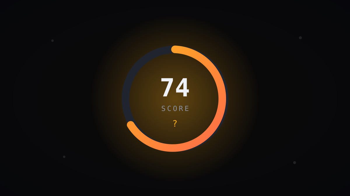
Every number we ship gets misread by someone, somewhere, as a grade. We have spent years designing the focus score to resist that reading, and watching customers use it well and badly. The difference between the two is rarely the maths. It is what people believe the number is for.
“A score that ends conversations is broken, no matter how accurate it is.”
What a score can and cannot know
Momentum’s focus score summarises behavioural signals: sustained attention, context-switch frequency, the ratio of core-work applications to everything else, calendar fragmentation. It is a good summary of how someone’s time was structured. It knows nothing about whether the work was any good.
A researcher staring at one paper for three hours scores identically whether the paper cracks the problem or leads nowhere. An engineer’s ugliest, most fragmented week might be the one where they saved the release. The score measures conditions, not outcomes, and conditions are all it should ever claim to measure.
We print a version of this caveat inside the product. People skip it. So the design has to enforce the humility the documentation merely requests.
This limitation is not a flaw to be engineered away. Conditions are worth measuring precisely because they are what managers can actually change. Nobody can decree better ideas, but anyone can protect a morning, kill a pointless meeting series, or notice that a team’s structure is eating its attention.
The verdict failure, up close
A 300-person BPO customer once wired the score into their quarterly bonus formula, against our written advice. Within six weeks, average scores rose nine points while their actual throughput, tickets resolved, fell. Agents had discovered that leaving a CRM window focused while taking longer breaks scored beautifully.
Goodhart’s law is not a curiosity; it is a guarantee. Any behavioural measure attached to money stops measuring behaviour and starts measuring gaming skill. The BPO unwound the policy within a quarter, but rebuilding the score’s credibility with their own staff took most of a year.
The lesson we took internally was blunter: if the product makes the verdict reading easy, some customer will always take it. Design has to make the question reading easier than the verdict reading.
Design choices that keep it a question
The score has no red zone. Thresholds invite judgement, so we show each person and team against their own trailing baseline instead of a universal target. A 62 means nothing; a 62 that was 78 for the previous two months means it is time to ask what changed.
We also refuse to rank. There is no leaderboard anywhere in Momentum, and individual scores appear to managers only through the approval workflow, with the employee aware. Aggregate first, always. A team trend is a systems question. A ranked list of names is a firing list waiting for a bad quarter.
And the number is deliberately coarse. We round aggressively and show weekly resolution by default, because a score precise to the decimal on a daily chart invites exactly the micro-inspection that turns analytics into surveillance.
The questions good managers actually ask
Watching skilled customers, the same handful of questions recur. What changed around week three? Is this whole-team or one project? Did we do this to ourselves with that new meeting series? Does the person’s own read match the pattern? Every one of these treats the score as a doorway.
A logistics company in Rotterdam gave us the cleanest example. Their operations team’s score sagged every month-end, reliably, for six months. The verdict reading says people slack at month-end. The question reading led them to a reporting process that forced 40 people to babysit a fragile spreadsheet for three days. They automated it. The sag vanished.
Notice the score never identified the problem. It only insisted, monthly, that a problem existed and was worth an hour of somebody’s curiosity. That is the entire job description of a good metric.
When the score drops and the person is fine
Low scores with innocent explanations are common, and how an organisation handles the first few determines whether people ever trust the number again. Onboarding weeks score low. Heavy mentoring scores low. Conference travel, planning phases, and cross-team firefighting all score low, and all can be exactly the right use of a week.
We encourage teams to name these openly: “expected-low” periods that everyone recognises. One engineering director in Warsaw annotates her team’s trend chart with release phases, so a dip during stabilisation reads as the cost of shipping rather than a mystery requiring explanation.
The moment someone feels obliged to defend a low number that was actually fine, the score has started governing behaviour. That is the early warning sign we tell every new customer to watch for.
One practical safeguard costs nothing: when a manager asks about a dip and gets an innocent answer, they should say so, plainly, and move on. “Makes sense, thanks” closes the loop. Silence after an explanation leaves the person wondering whether the number is still counting against them somewhere, and that wondering is corrosive.
Scores in the room, not in the file
Our rule of thumb: a score belongs in conversations and never in records. Use it in a one-on-one, a retro, a capacity discussion. Keep it out of performance files, promotion packets, and PIP documentation, where it will be read years later, stripped of context, as a verdict by people who never met the person.
Several customers have formalised this in their works-council agreements, and we think that is the right instinct. Writing down what a metric will not be used for is worth more than any dashboard feature we could build, because it survives management changes. Dashboards get reinterpreted. Agreements get enforced.
The Rotterdam team went a step further and publishes its usage rules on the internal wiki, four sentences long, reviewed yearly. New joiners read exactly what the score is for before they ever see one. Ninety seconds of reading, and the verdict interpretation never gets a chance to take root.
A test you can run this week
Here is the diagnostic we offer every customer. Pick the last three times a score appeared in a management conversation, and ask what happened next. If the answer was a question to a human, the metric is healthy. If the answer was a judgement about a human, stop and fix the culture before touching the dashboard.
Numbers are patient. They will wait while you get the conversations right.
And when you do, the score becomes what it was always meant to be: the beginning of understanding, never the end of it.
points of score inflation while real throughput fell, after one customer tied the score to bonuses
If you only remember four things
- The focus score measures how time was structured, never whether the work was good, and every design decision has to enforce that humility.
- Wiring the score into bonuses at a 300-person BPO raised scores nine points while actual throughput fell, a textbook Goodhart failure.
- Compare people and teams only to their own trailing baseline; Momentum ships no red zones, no leaderboards, and no rankings.
- Keep scores in conversations and out of performance files, where they will later be read as verdicts stripped of all context.
Writes for The Signal about analytics and the future of measurable, humane work — drawing on anonymised patterns from the teams and focus hours analysed on Momentum.
Want this picture for your teams?
See timelines, productivity scores, and department comparisons on your own data.
Book a demo