How to read a productivity heatmap

A heatmap is the most misread chart in workforce analytics. New managers stare at the dark cells and hunt for slackers; experienced ones read the shape of the week. Here is how we teach the second habit, using patterns from real deployments.
“A heatmap never tells you who is lazy. It tells you when your organisation is lying to itself about how the week works.”
Start with the shape, not the cells
When we onboard a new customer, the first heatmap review has a rule: nobody is allowed to name an individual for the first thirty minutes. We look only at the silhouette of the week. Where does intensity rise? Where does it collapse? Does the shape match what leadership believes about the team?
It usually doesn’t. A 60-person product organisation in Berlin was certain their crunch happened before Thursday releases. The heatmap showed peak focus on Tuesday mornings and a long, pale Thursday, because release days were actually spent waiting on pipelines and answering questions in chat.
That single reframing, shape before cells, prevents most of the abuse this chart invites.
The Tuesday ridge and the Friday cliff
Across the focus hours we analyse, two features appear in a large majority of knowledge-work teams. Focus peaks Tuesday and Wednesday between roughly 10am and noon, and falls off sharply after 2pm on Friday. Not gradually. A cliff.
Neither is a problem by itself. The problem is what organisations schedule against the pattern. Sprint planning at Tuesday 10am burns the best two hours of the week on a meeting that would run identically on Friday afternoon, which is otherwise producing very little anyway.
One customer moved exactly two recurring meetings after seeing this. Measured deep-work hours rose 11 per cent within a month, with no other change.
The Friday cliff deserves its own defence, incidentally. Some leaders see it and want to flatten it. We advise the opposite. Teams whose Fridays stay pale tend to show stronger Tuesday ridges the following week. The cliff is not waste; it is where the ridge gets paid for.
Reading heat that shouldn’t be there
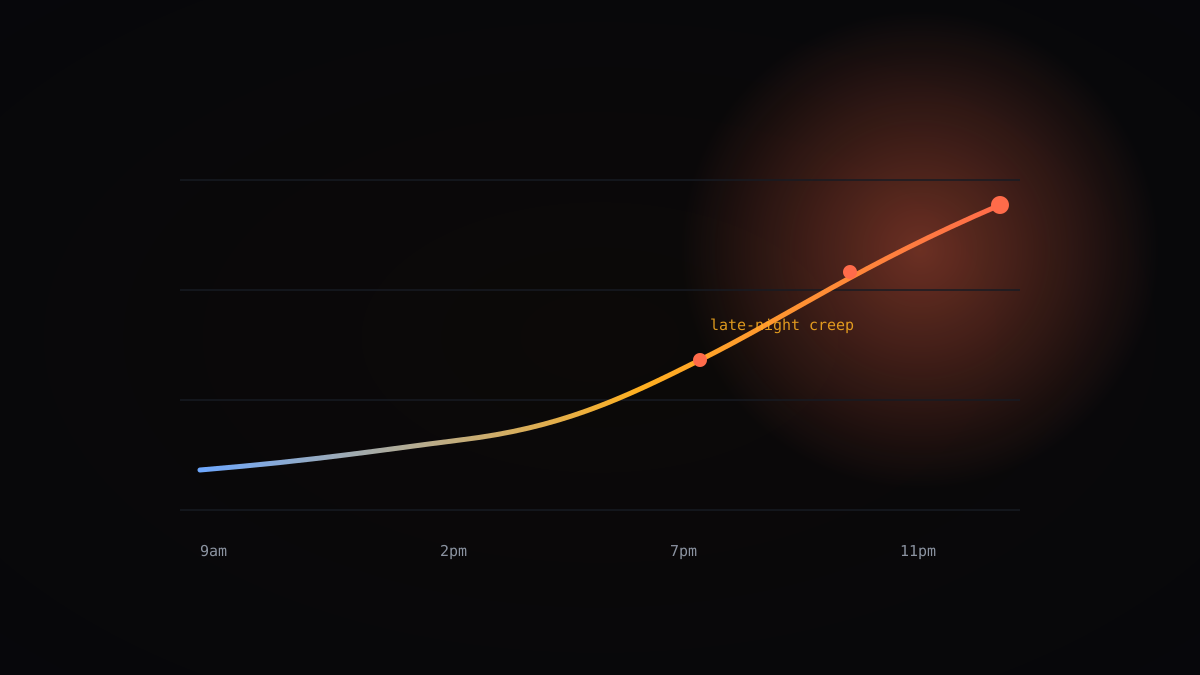
The cells that deserve your attention are rarely the pale ones. They are the dark cells at 9pm, the warm Saturday morning stripe, the person whose intensity never drops below the team average at any hour of any day.
We watched this play out with a data team in Toronto. Their heatmap looked enviable for a quarter: dense, consistent, spilling into evenings. Two resignations later, the pattern read very differently. Sustained evening heat is not commitment. It is the most reliable early burnout signal we have.
Healthy heatmaps breathe. They have hot mornings, cooler afternoons, and genuinely cold nights and weekends. Uniform intensity is a fire alarm with the volume turned down.
Bottlenecks show up as synchronised cold
Here is a subtler read. When an entire team goes pale at the same hour on the same days, week after week, something upstream is starving them. For a payments team we studied, the cold band was 11am to 1pm every Monday, which turned out to be the window where they waited on a risk-review queue owned by another department.
Individual heatmaps would have suggested twelve people with a motivation problem. The team view, stacked, showed one process problem with twelve victims.
This is why we resist per-person defaults so stubbornly. The organisational reads are the valuable ones, and they only exist in aggregate.
Once the payments team took the stacked view to the risk department, the queue got a second reviewer for Monday mornings. The cold band dissolved within a fortnight. Twelve individual coaching conversations would have fixed nothing and poisoned plenty.
Adjust for the work before you judge the colour
A pale afternoon means something different for a designer than for a support agent. Category context matters: our heatmaps can be filtered by app classification, so you can see whether cool cells contain meetings, communication, or genuine idle time.
Sales teams look ‘unfocused’ on raw activity because calls dominate their day. Filtered by category, the same team shows a perfectly sensible rhythm of calls, notes, and CRM updates. Judging them on a developer’s heat profile would be analytical malpractice.
Before any conclusion, ask: what should this role’s week look like? If you cannot answer, the chart cannot either.
We encourage customers to build a reference profile per role during onboarding, agreed with the team itself rather than imposed. It takes an hour and pays for itself the first time a director wanders into the analytics view and starts drawing conclusions about a function they have never done.
Seasonality will fool you at least once
Every new customer has a moment of panic in their first quarter-end, first regional holiday season, or first post-launch lull. The heatmap goes strange and someone assumes the team has checked out. Then the same pattern appears in last year’s payroll data and everyone calms down.
We now ship twelve-week comparison views for exactly this reason. A cold fortnight against a cold fortnight last cycle is a season. A cold fortnight against a hot one is a question worth asking.
Never read a heatmap shorter than three weeks. Single-week reads are astrology.
Regional calendars compound the trap for distributed teams. A pale Munich Monday might be a public holiday your dashboard in Chicago knows nothing about. We annotate regional holidays automatically now, after one memorable support ticket accusing an entire Polish office of a coordinated slowdown on Assumption Day.
A fifteen-minute weekly ritual
The managers who get the most from this chart spend the least time on it. Fifteen minutes, once a week, three questions. Did the shape change from the trailing average? Is there heat where there should be rest? Is there synchronised cold that points upstream?
Anything that survives those three questions becomes a conversation, not an accusation. ‘I noticed the team’s evenings have been warm for three weeks, what is driving that?’ lands very differently from a screenshot in a performance review.
The heatmap is an instrument. Played gently, it tells you things surveys never will. Played hard, it just makes noise.
And when you find nothing? Say so. A quick note that the week looked normal costs thirty seconds and teaches the team that the chart is being read with judgement rather than suspicion. Silence, in our experience, is what people fill with worst-case stories.
If you only remember four things
- Read the shape of the week before any individual cell, and ban name-hunting in the first review.
- Focus reliably peaks Tuesday and Wednesday mornings; scheduling recurring meetings there burns the best hours of the week.
- Sustained evening and weekend heat is the earliest burnout signal in the data, not a sign of commitment.
- Synchronised cold bands across a whole team point to an upstream process bottleneck, not a motivation problem.
Writes for The Signal about analytics and the future of measurable, humane work — drawing on anonymised patterns from the teams and focus hours analysed on Momentum.
Want this picture for your teams?
See timelines, productivity scores, and department comparisons on your own data.
Book a demo